

Overview
Hada (하다) is the Korean word for “Do” (Ex: Just Do It). Hada Tea acts upon creating a diverse product line that focuses on Asian cuisine, utilizes sustainable, eco-friendly packaging and transparent ingredient lists, and provides food insecurity assistance to feed local communities in need.
Roles
- Product/UX Designer - Desktop, Mobile Website
- Brand, Logo Designer
Tools Used
- Notion
- Figma, Procreate, Adobe Illustrator
Team
- Francis Lee (Co-Founder)
- Sean Jung (Co-Founder)
- Hasina Rashed (Food Scientist)
- John Ticzon (UX Researcher)
Length: Nov 2021 - Present
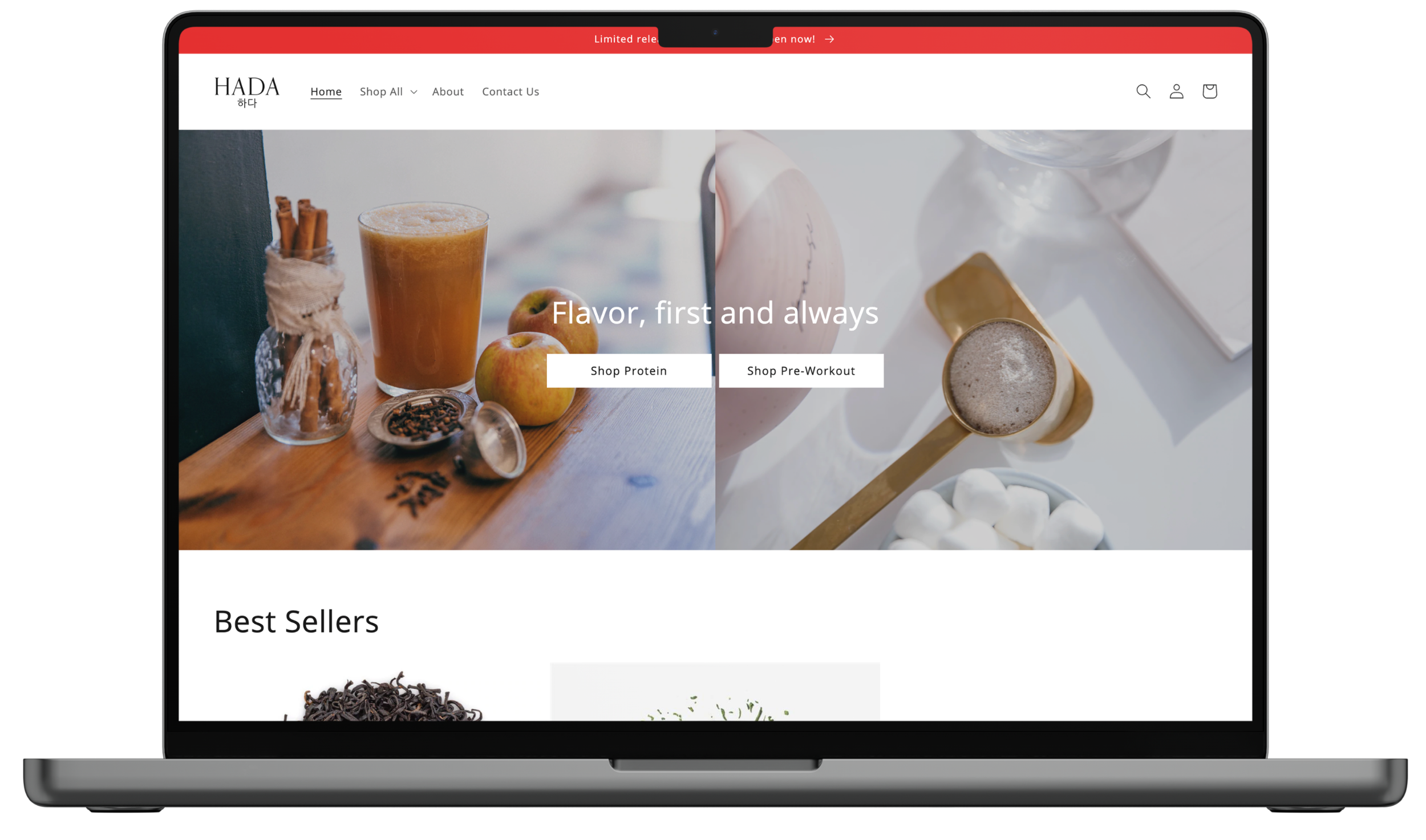
We want to design a website for a workout supplement brand inspired by Korean desserts and teas, as there are no items in the market that addresses these flavors today.
Problem Statement
The UX Design Process
-
Skip to here
We want to see what pain points users face when looking for a protein supplement and learn what their buying process is.
Key Pain Points SummaryLack of transparency in ingredient lists
Lack of all-natural ingredients
Differing levels of creatine for night workout enthusiasts
-
Ideate to address pain points as we set up website goals, starting with information architecture.
-
-
Until the product goes live in late 2022, we will continue to collect feedback and iterate on improving the user experience.
1. Brainstorm & User Research
We began by interviewing 8 participants with fitness experiences ranging from new to very experienced, to better understand what their buying behavior is like.
Do you take fitness supplements?
If “Yes” What do you take?
What do you not like about fitness supplements?
What would your dream supplement be?
Questions
Key Pain Points
Participant 1 stated that a pain point was when “pre-workout with proprietary blends that hide transparency from the consumer”
Participant 8 pointed out “Don’t like how they don’t know what the purpose of all the ingredients do”
Shows that there is a need for clarity on the packaging and website, as well as creating a FAQ to educate popular ingredients may be beneficial for those new in their fitness journey
1. Lack of transparency in ingredient lists
Participant 4 stated “Ingredients are not always all-natural”
Shows experienced fitness participants/consumers are very conscious on the ingredient list to be natural
2. Lack of all-natural ingredients
Participant 1 gave the personal use case of preferring a night workout, however the standard amount of creatine in all supplements they have tried is too much — would prefer there to be differing levels of creatine as options
3. Differing creatine/caffeine levels to fit different workout schedules
2. Ideate & Wireframe
Prior research confirmed there was a clear demand for a better, more transparent way for consumers to understand what ingredients and key benefits go into workout supplements.
An experienced food scientist joined the project to create the recipe for the protein, pre-workout, and shake powders. We collaborated quite often to sync with flavor development, creating the nutritional label - based on packaging and design, and writing out the ingredient list + updating it as necessary.

Website Goal: Less clicks as possible to check out an item
Simple/Clean - The owners’ ask
Easy to use interface (Accessibility)
Engaging with the target market (Asian-Americans)
3. Design Low & High Fidelity
Low Fidelity
4. Solution & User Testing
Persona
Logo